
 Tattoo Ideas & Designs
How Do Tattoo Artists Connect Existing Tattoos Into a Sleeve...
Published On 07-10-2026
Published by the Tattoo Shops Near You Editorial Team
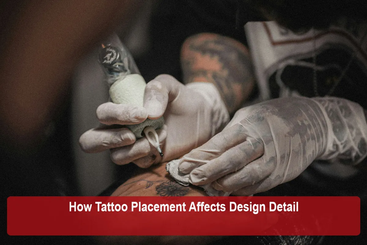
Most people choose a tattoo placement based on visibility, personal meaning, or how the design will look in the mirror. Those are all valid reasons, but placement also quietly decides how much detail a design can hold and how well that detail survives the years. The same drawing can read crisply on one part of the body and blur or distort on another. Understanding why helps you make a placement choice that supports your design instead of working against it.
This guide looks at the physical features of different body areas, including skin texture, curvature, movement, friction, and sun exposure, and explains how each one shapes what an artist can realistically put there.
A tattoo is not printed on a flat sheet of paper. It sits in living skin that bends, stretches, creases, ages, and gets exposed to the elements. Every area of the body combines these factors differently. A design that looks balanced on a tablet screen has to be translated onto a surface with its own shape and behavior.
Experienced artists think about placement and detail together from the start. When an artist suggests moving a design, rotating it, enlarging it, or simplifying certain elements, they are often responding to the realities of the placement rather than questioning your idea. Knowing the factors behind those suggestions makes the conversation easier and helps you weigh your options.
Skin is not uniform. Some areas have thinner, more delicate skin, while others are thicker and firmer. Some areas are smooth and taut, while others are softer or more prone to wrinkling. These differences can influence how cleanly ink settles and how lines hold their shape over time.
Firm, even areas such as the outer forearm, upper arm, and calf are commonly described by artists as reliable surfaces for fine detail. The skin tends to be consistent, which gives the artist a stable canvas to work on. Areas where the skin is thinner, looser, or more variable can be less predictable, and artists may recommend bolder linework or a more open composition to account for that.
This does not mean detailed work is impossible on trickier skin. It means the artist may adjust line weight, spacing, or shading approach to give the design the best chance of aging well.
Almost no part of the body is truly flat. Arms and legs are roughly cylindrical, shoulders are rounded, and areas like the ribs, collarbones, and ankles have complex contours. Curvature matters because a design is viewed from the outside of that curve.
On a strongly curved surface, parts of the design wrap around the body and fall out of view from any single angle. Straight lines can appear bent, circles can look oval, and lettering that runs around a limb may be impossible to read all at once. Fine geometric work is especially sensitive to this because its appeal depends on precise symmetry.
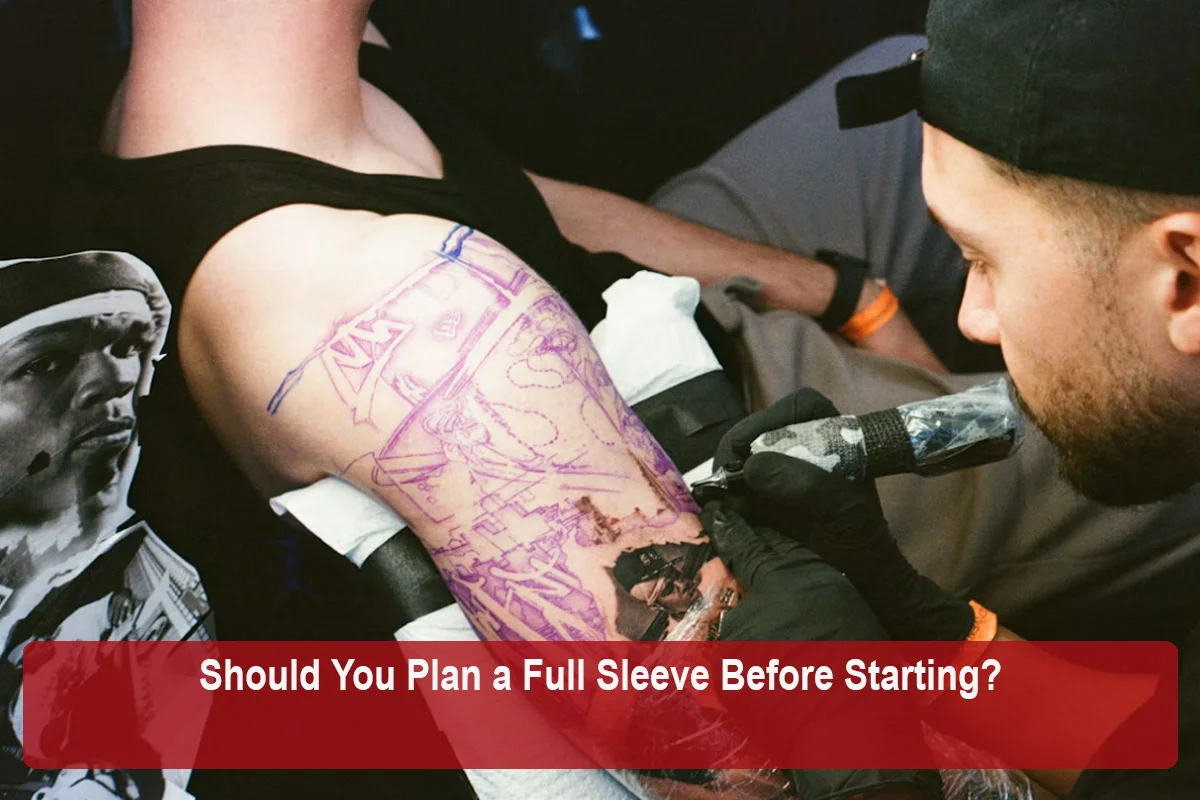
Artists handle curvature in several ways. They may place a design along the length of a limb rather than around it, choose organic shapes that look natural on a curve, or position the most important elements on the flattest part of the area. For symmetrical designs, the stencil stage matters a great deal, and many artists will adjust and reapply a stencil more than once until it sits correctly on your body.
Joints and high-movement areas add another layer of complexity. The inner elbow, the back of the knee, the wrist, the fingers, and the area around the armpit all fold and stretch regularly. Skin in these areas is constantly changing shape.
When skin creases along the same line repeatedly, fine details sitting in that crease can be harder to see and may be more prone to softening over time. A design that crosses a joint can also look different depending on whether the limb is bent or straight. Some people enjoy that sense of motion, while others find it frustrating.
For detail-heavy pieces, artists often recommend keeping the focal point away from the main crease lines and letting simpler elements, such as background shading or flowing linework, cover the moving areas. If you want a joint placement, ask your artist how the design will look in different positions before committing.
Some placements experience a lot of everyday contact. Hands and fingers touch nearly everything, feet rub against shoes and socks, and areas under waistbands or bra straps deal with ongoing pressure and rubbing. These high-wear zones are commonly associated with faster fading and softer lines.
Many artists are upfront that tattoos in these areas may need touch-ups more often and may not hold fine detail as long as more protected placements. For this reason, artists frequently suggest bolder, simpler designs for fingers, palms-adjacent areas, and feet. Tiny lettering or intricate fine line work in these zones is where you are most likely to hear an artist recommend changes.
If you have your heart set on a high-wear placement, a good approach is to ask the artist what style they feel will hold up best there, and to look at healed examples of their work in similar spots.
Placements that see a lot of sunlight, such as the outer forearms, hands, neck, and the tops of the feet, face more long-term exposure than areas that are usually covered. Sun exposure is widely cited by artists as one of the main contributors to fading over time.
Fine details, light shading, and pale colors tend to show the effects of fading first, because they have less ink to lose before they become hard to see. Bold outlines and solid black areas generally keep their structure longer. This is one reason why detailed work in sun-exposed areas benefits from consistent sun protection once the tattoo has healed, following whatever aftercare guidance your artist provides.
When comparing placements for a delicate design, it can help to consider how often that area is uncovered in your daily life, not just how often it will be visible to others.
Detail only matters if it can be seen. Some placements are usually viewed up close, like the inner forearm, which you look at yourself all day. Others are usually seen from further away, like the back, which you will mostly see in photos and mirrors while others see it from across a room.
A design with very small internal details may lose its impact on a placement that is mostly seen from a distance. On the other hand, a large placement like the back or thigh can support detailed work because the design itself can be scaled up to match the space. Thinking about how people, including you, will actually look at the tattoo helps you choose the right balance between intricacy and readability.
The table below gives a general overview of how different areas are commonly discussed by artists in terms of detail. Individual results depend on the artist, the design, and your skin, so treat this as a starting point for conversation rather than a rulebook.
| Placement | Common Surface Traits | Typical Detail Considerations |
|---|---|---|
| Outer forearm | Fairly even, moderate curve | Often considered a strong spot for detail; sun exposure is a factor |
| Inner forearm | Smooth, relatively flat, viewed up close | Frequently chosen for fine line and lettering |
| Upper arm and shoulder | Rounded surface, good size | Supports detail when the design is shaped to the curve |
| Back | Large, relatively flat, seen from a distance | Excellent for large detailed pieces; tiny designs can feel lost |
| Ribs and sides | Curved, shifts with breathing and posture | Detail is possible, but placement and stencil alignment need care |
| Thigh | Large, fairly even surface | Well suited to detailed and larger designs |
| Hands and fingers | High friction, frequent washing, sun exposure | Artists often recommend bold, simple designs |
| Feet and ankles | Bony, curved, rubs against footwear | Fine detail may soften faster; simpler designs often suggested |
| Joints (elbow, knee) | Constant bending and creasing | Focal details are usually kept away from crease lines |
Design density describes how much is packed into a given area: how close the lines are, how many small elements are included, and how much negative space is left. Placement and density work together. A dense design on a spacious, stable placement can look rich and intentional. The same density squeezed onto a small, curved, or high-movement area can start to look muddy.
If you love a detailed concept, you generally have three levers to pull. You can give it a larger or more stable placement, you can increase its overall size, or you can simplify the design to suit the placement you prefer. Most good outcomes come from a mix of all three, worked out with your artist.
Negative space is often underrated here. Leaving breathing room between elements helps details stay distinct as the tattoo ages, and it tends to matter more on placements that are prone to movement or fading.
A skilled artist rarely just shrinks or enlarges a drawing to fit. They adapt it to the body. Common adjustments include:
These changes are usually about helping your idea look its best on you specifically. Reviewing the stencil in a mirror and moving around to see how it sits in different positions is a normal and encouraged part of the process.
Different styles respond to placement in different ways. Bold traditional work is often described as forgiving on a wide range of placements because of its strong outlines and solid fills. Fine line and micro realism rely on subtle detail, so they tend to be more sensitive to placement choices. Realism and portrait work often benefit from larger, stable areas where the artist has room to build depth.
It also helps to look at where an artist has placed similar work in their portfolio. An artist who regularly posts healed fine line pieces on ribs or ankles likely has experience adapting that style to those surfaces. Healed photos are especially useful here, since they show how detail has held up after the skin settled.
Bringing a few focused questions to your consultation can help you understand the tradeoffs clearly:
An artist who explains their reasoning openly is giving you the information you need to make a confident choice.
Placement shapes detail in ways that are easy to overlook when you are focused on the design itself. Skin texture, curvature, movement, friction, sun exposure, and viewing distance all influence how much detail a spot can hold and how that detail ages. None of these factors rule out any particular idea, but they do explain why artists sometimes suggest adjustments.
The best results usually come from treating placement and design as one decision. Share your priorities with your artist, listen to their reasoning about the area you have in mind, and look at healed work in similar placements. With that approach, your tattoo can look as intentional years from now as it does on the day it is finished.
This article was reviewed by the Tattoo Shops Near You Editorial Team for accuracy, clarity, and relevance. We use reliable industry resources, official business information, and other authoritative sources where applicable to help readers make informed decisions about tattoo shops, artists, styles, and services.
Last reviewed: October 2026
Tattoo Ideas & Designs
 Tattoo Ideas & Designs
 Tattoo Ideas & Designs
 Tattoo Ideas & Designs