
 Tattoo Styles
Do Hand Tattoos Need More Touch-Ups?
Published On 05-10-2026
Published by the Tattoo Shops Near You Editorial Team
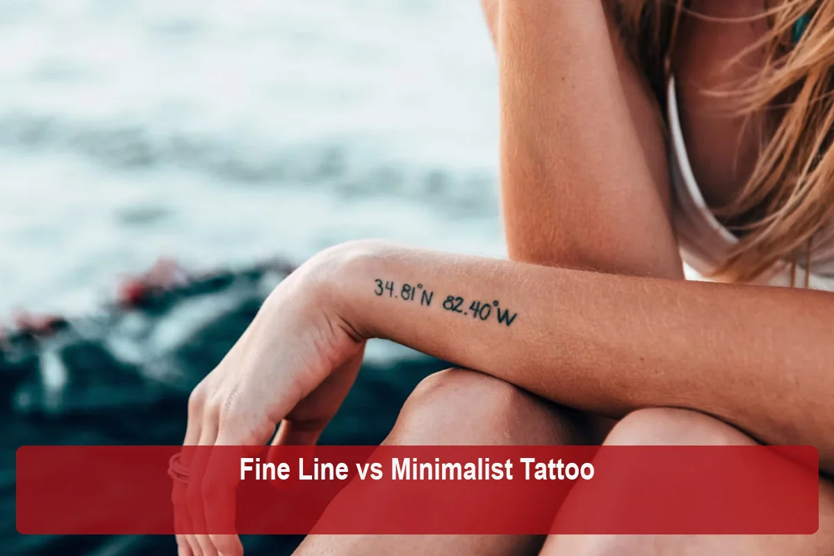
These two terms overlap so often in practice that they get treated as synonyms, but they are actually describing two different things. Fine line refers to line weight and technique, how thin and delicate the actual lines of a tattoo are. Minimalist refers to design philosophy, how much or how little visual content a design includes. A tattoo can be one without being the other, even though the two frequently show up together.
Fine line is fundamentally about the thickness of the lines used, thin and delicate rather than bold and thick, generally achieved through a single needle or a small needle grouping run with a light, controlled hand. This says nothing on its own about how much detail or how many elements are in the design. A fine line tattoo can be a single simple symbol, or it can be a dense, highly detailed botanical piece with dozens of small elements, all still rendered in thin, delicate lines.
Minimalist refers to a reduction in content and complexity, a design stripped down to its simplest, most essential form, regardless of how thick or thin the lines used to create it happen to be. A minimalist tattoo could be a single bold geometric shape, a simple thick-lined symbol, or a small, uncomplicated outline, all executed with heavier, bolder linework rather than anything delicate. The defining feature is simplicity of content, not the weight of the line itself.
A lot of minimalist designs happen to be executed in fine line, since a simple, reduced concept often pairs naturally with a delicate, understated line weight, and a lot of fine line work happens to be simple in content, since thin lines are frequently used for small, uncomplicated symbols and script. This overlap is genuinely common, which is exactly why the two terms get used interchangeably so often, even though one is describing a technique and the other a design approach.
The distinction becomes clearer once you look at designs that are one without being the other. A detailed fine line botanical sleeve, covered in delicate but numerous flowers, leaves, and linear detail, is fine line but not minimalist, since the sheer volume and complexity of content is the opposite of reduced. A bold, thick-lined single geometric shape or a simple bold symbol, on the other hand, is minimalist but not fine line, since the line weight itself is heavy rather than delicate. Recognizing that these are two independent qualities, rather than one implying the other, helps you communicate more precisely with an artist about what you actually want.
If you tell an artist you want a minimalist tattoo without specifying line weight, you might get a bold, simple design when you were actually picturing something delicate, or vice versa. Being specific about both qualities separately, how much content the design should include and how thick or thin the lines should be, gives an artist a much clearer picture of what you actually have in mind than relying on either term alone to communicate both ideas at once.
A minimalist design, particularly one with bold, thick linework and simple content, tends to hold up reasonably well even at a smaller size, since there is less fine detail at risk of blurring together as the tattoo ages. Fine line work, by contrast, carries more general fading and blurring risk regardless of how simple or complex the content is, since the risk comes specifically from the thinness of the lines rather than how much is included in the design. A fine line minimalist piece, combining both qualities, generally benefits from the same size and placement caution that any fine line work does, while a bold minimalist design has somewhat more flexibility on that front.
Because fine line's aging risk comes from line thickness rather than content, a delicate fine line design, minimalist or not, is more prone to softening and blurring over time than a bolder, thicker-lined minimalist piece would be. If long-term crispness matters more to you than achieving a particularly delicate aesthetic, a bolder minimalist approach may hold up more reliably over the years than an equally simple design rendered in very fine lines.
When evaluating an artist for fine line work specifically, focus on line consistency, steadiness, and healed examples, as covered in more depth elsewhere. When evaluating an artist for minimalist work specifically, focus instead on composition, how well they distill an idea down to its essential form, and how confidently they handle negative space and simplicity without a design feeling unfinished or underdeveloped. These are somewhat different things to look for, even when reviewing the same portfolio.
| Aspect | Fine Line | Minimalist |
|---|---|---|
| What it describes | Line thickness and technique | Amount of content and complexity |
| Can be complex or detailed | Yes, if lines stay thin | No, by definition it stays simple |
| Can use bold, thick lines | No, by definition lines stay thin | Yes, often does |
| Primary aging risk | Line thinness regardless of content | Lower risk if lines are bolder |
Understanding that fine line and minimalist are two separate, independent qualities gives you a more precise vocabulary to use during a consultation. Rather than reaching for whichever term feels closest, describing both what you want the design to include and how you want the lines themselves to look gives an artist a clearer, more complete picture of the result you are actually hoping for, reducing the chance of a mismatch between what you pictured and what gets tattooed.
Minimalist tattoos sometimes get grouped with other related terms, such as single line or contour designs, which describe a specific technique for achieving simplicity rather than simplicity itself as a broader design goal. A single line tattoo is one particular way of executing a minimalist concept, drawing it as one unbroken stroke, but minimalism itself is a broader category that includes plenty of designs not built from a single continuous line at all. Keeping these related but distinct terms straight helps you communicate even more precisely about what specific combination of qualities you are actually looking for.
One of the more common miscommunications happens when someone shows an artist a reference image and simply says they want something similar, without clarifying which specific quality drew them to that reference, the line weight, the content simplicity, or both. If a reference happens to be both fine line and minimalist, and you only end up with one of those two qualities in the final result, it can feel like a genuine mismatch even though the artist may have accurately captured part of what the reference showed. Naming both qualities explicitly, rather than relying on the reference image to communicate everything, closes this gap.
If you are building a small collection of tattoos over time and want them to feel visually cohesive, deciding early on whether you are generally drawn to fine line, minimalist content, or both together helps keep future additions consistent with what you already have. A collection that mixes bold minimalist pieces with delicate fine line work can still look intentional and cohesive, but it benefits from a clear sense of which qualities are actually doing the visual connecting, rather than assuming the vague idea of simplicity alone will tie everything together consistently.
Understanding the distinction also changes how productively you can search for reference images before ever reaching out to an artist. Searching specifically for bold minimalist designs will surface different results than searching for fine line work, even though both searches might return images described casually as simple or minimalist online. Being precise about which quality you are actually searching for helps you gather a more accurate, useful set of references to bring into your eventual consultation.
It is entirely possible, and common, to want both a simple, reduced design and delicate line weight in the same tattoo, which simply means you are looking for a piece that sits at the intersection of fine line and minimalist rather than choosing one over the other. Naming both qualities explicitly to an artist, a design with minimal content and thin lines, rather than relying on either single term alone, is the clearest way to communicate that you want both, not just one or the other.
It can help to think of fine line as answering the question of how the lines look, and minimalist as answering the question of what the design includes. Keeping those two questions separate in your own mind, and in the way you describe your idea to an artist, is the most reliable way to avoid the confusion that these two frequently interchanged terms tend to cause.
Once that distinction is clear, choosing between them, or deliberately combining both, becomes a much more straightforward part of planning your tattoo rather than a source of mismatched expectations.
This article was reviewed by the Tattoo Shops Near You Editorial Team for accuracy, clarity, and relevance. We use reliable industry resources, official business information, and other authoritative sources where applicable to help readers make informed decisions about tattoo shops, artists, styles, and services.
Last reviewed: September 2026
Tattoo Styles
 Tattoo Styles
 Tattoo Styles
 Tattoo Styles